Project overview
The product:
Streamlined loan origination and approval workflow for Commercial Division of ANZ
Project duration:
Initial System Design set up was about 8 weeks with an ongoing development and maintenance for the entire duration of the project (about 24 months)
The problem:
Existing components are scattered and doubled up across different squads working on the solution resulting inconsistent design and increased amount of effort to put the designs together.
The goal:
To create a centralised resource for design assets, promoting consistency through shared guidelines, enabling reusability of components, fostering collaboration among teams, and supporting scalability and maintenance of design efforts, and deliver more cohesive and user-friendly solutions.
My responsibilities:
Research and Analysis
Existing components and patterns
Inconsistencies across different squads
User needs and pain points
Business goals
Technical constraints
Audit of existing design assets
I’ve conducted a comprehensive audit of all existing design assets, including UI elements, patterns, typography, colors, icons, and layouts used across different products and teams. This included Visual Audit (look and feel), Interaction Audit (how they are sourced and used), Accessibility Audit.
Here are examples of some assumptions I made pre research and the audit outcomes:
Assumption 1:
There are inconsistencies and variations in design components across different project squads.
Outcome:
The audit revealed that inconsistencies are more widespread than initially assumed. It also uncovered underlying reasons for these inconsistencies, such as use of different design platforms (Sketch and Figma), absence of library from the vendor and lack of clear guidelines.
Assumption 2:
Some design elements are duplicated or redundant, leading to inefficiencies and inconsistencies in user experience.
Outcome:
The audit showed that some duplicated design elements serve unique purposes and are necessary for specific contexts while most are indeed duplicates.
Assumption 3:
Collaboration and communication gaps between teams have contributed to the scattered and duplicated design components.
Outcome:
The audit revealed root causes of collaboration and communication gaps, leading to a deeper understanding of the underlying issues and potential solutions to enhance collaboration.
Assumption 4:
The audit will uncover opportunities to streamline design assets, establish standards, and improve the overall design consistency and coherence.
Outcome:
The audit findings confirmed assumptions about opportunities to streamline design assets and establish standards, while also uncovered additional areas for improvement and unexpected challenges that need to be addressed.
Pain points
Without a design system, designers struggle to maintain consistency in design elements like colors, typography, spacing, and UI components, resulting in a fragmented user experience that feels disjointed and unprofessional.
Designing each new screen or component from scratch is time-consuming and inefficient. Designers keep on reinventing the wheel for common elements, which can slow down the design process and delay project timelines.
Definition of
Design Principles
User-Centricity
Consistency
Simplicity
Accessibility
Hierarchy and Structure
Flexibility and Scalability
Through my research, I uncovered valuable insights into the pain points, challenges, and expectations of designers, developers, product owners, and other stakeholders engaged in the CLP project. This knowledge equipped me with a clear understanding of the design system requirements necessary to address these findings effectively.
My delivery goal is to ensure a seamless user experience by upholding both visual and functional consistency throughout the design system. By employing uniform design elements, patterns, interactions, and terminology across the workflow, we aim to minimize cognitive load and improve overall usability.
The design system should be simple and clear. That includes simplicity in both:
Everyday use of the system and its components by other designers such as clear use processes, structure, naming convention and documentation.
Design patterns for the end users to ensure minimum cognitive load and absence of unnecessary elements
The elements are to be accessible to users of all abilities, including those with disabilities. Follow best practices for inclusive design, such as providing alternative text for images, and ensuring proper color contrast, to make the platform usable for a diverse range of users.
By establishing a clear hierarchy and structure of the design system, designers can be more efficient in creating new and amending existing screen designs and create a visually cohesive and intuitive experience. This not only enhances usability but also contributes to consistency, efficiency, and overall user satisfaction with the design system.
The goal is to create a design system that is scalable and flexible to accommodate future growth, changes, and enhancements. Anticipate evolving business requirements, regulatory compliance, and technological advancements to ensure the longevity and adaptability of the system.
Component Design
and Documentation
Modularity
Flexibility
Documentation
Versioning
Testing
Modularity
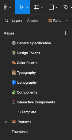
As a first step I have divided the future design system into different modules:
Design
Tokens
Colour Palette
Typography
Iconography
Components
Interactive Components
Patterns
I use atomic design approach and I demonstrate my process of creation of all elements in my article "Creating a Universe" that you can find here

Patterns
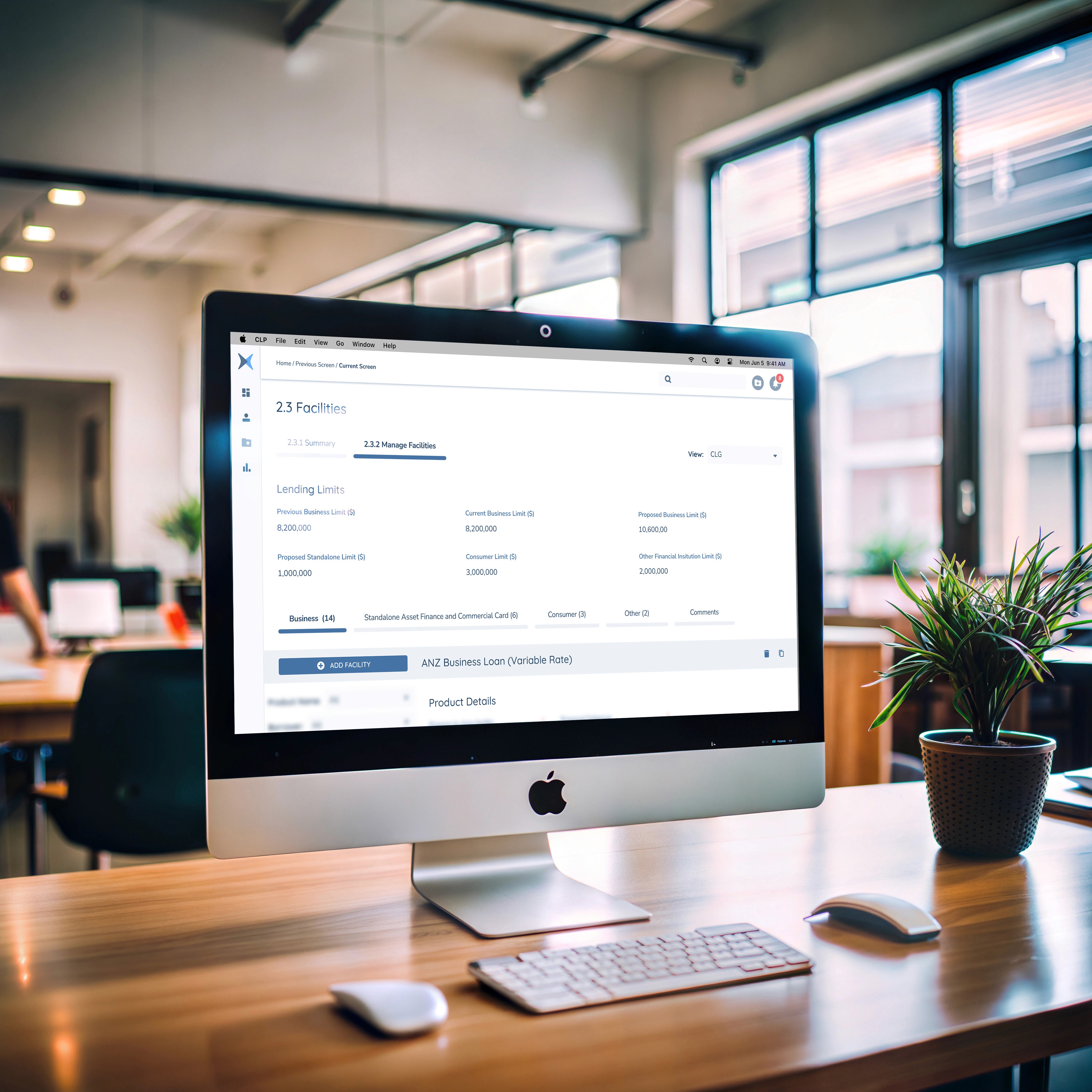
Now that I have ensured consistency and interactivity of the components I have decided to take the design system further and make some advanced screen patterns.
The way CLP project is structured is that it split into 5 separate squads that are responsible for different areas of the application e.g. Entity profile and general application info, loan proposal, product details, journey hub, facilities.
All squads are working simultaneously and overlapping on some screens. For example one squad is working on Product Details attributes, but Product Details are showing on Facilities screens that is worked on by another squad.
By creating complex design patterns we can work on different areas of the screens at the same time and all screens will always have the latest designs.
First I have created a fully responsive base interface that has standard top and side navigation bars.
This already saved designers a lot of time, and the task that previously take a few minutes to put together is now only one drag and drop.

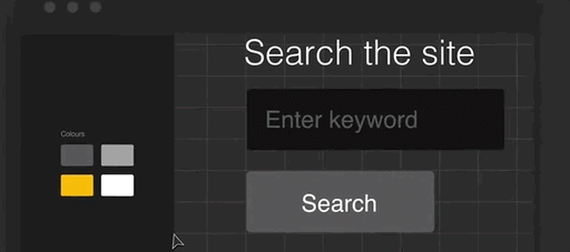
After considering a few options I’ve decided that the best approach to create patterns is splitting the screens into interchangeable panels.
That way some designers can work on the content of the panels while other designers can consume these panels in their designs of bigger blocks of the platform interface.
I’ve identified commonly used types of panels and created variants of those panels.
Here are a few examples of the panels I’ve designed.
NOTE: content of fields and labels is redact due to sensitive information as per Non Disclosure Agreement

Then I put it all together into different variants of the main application component.
That allowed any designer to rapidly create a screen of any area of the platform with a few quick property selections.
Here is a scenario when a designer needs to amend Facility Detail where they need to change Fee Details table to Product Detail Table.
Normally this task can take a few hours to action, but here it takes 5 seconds!

Utilizing atomic design principles, where patterns are composed of elemental primitives, ensures that updating designs is both secure and straightforward. Any modification made to a single instance automatically propagates across all designs that incorporate the same element or pattern.
This methodology proves particularly invaluable when tackling large and complex projects, such as this one, characterised by a multitude of screens disseminated across various platforms and accessed by numerous project stakeholders. These designs serve as a pivotal reference point for tasks ranging from user testing and development to discussions on new features among product owners.
Accessibility considerations
All components were tested for ADA and WCAG compliance. Providing sufficient color contrast, clear typography, and proper focus states enhances accessibility.
All input fields were linked with alternate text descriptions to be provided to the development team. This ensures that visually impaired users can receive audio prompts regarding the current field they are navigating.
Feedback from accessibility experts was collected and it allowed designers to identify and address potential barriers early in the design process, leading to a more accessible and user-friendly design system that caters to a diverse range of users.
Summary
Takeaways
Takeaways
Impact
Establishment of the CLP design system had a massive impact on the project:
Designers consistently use pixel perfect components
Patterns allowed designers to save a lot of time and even enabled them to make rapid prototypes in real time while in a meeting with Journey Experts, Product Owners and other squad members saving months of designers time
It allowed for concurrent design of different areas of the platform while having all live prototypes up to date eliminating risk of outdated designs and bottlenecks when a squad had to wait for certain designs to be finished before they can commence their work.
What I learned:
Working on this project allowed me to work on a big and complicated platform that involved five large teams and many different people like designers, testers, developers, and others. I learned a lot about creating a solution that can grow with the product's needs. I learned how to design with flexibility in mind, making it easy to update and expand.
Project Insides
Building trust and engagement
How I influenced a change
How I handled a difficult conversation
on the project
How I handled issues such as an unhappy
stakeholder
STARs
Building trust and engagement
Building Trust and Engagement Throughout the ANZ Loan Origination Project
This project, involving five large teams and numerous stakeholders (designers, developers, testers, product owners, etc.), required an effort to build trust and foster engagement. My approach focused on open communication, collaboration, and demonstrable value.
1
Early and Consistent Communication
Proactive Engagement:
I initiated contact with key stakeholders early in the project, before the formal kickoff. This allowed me to understand their individual needs, concerns, and expectations, laying the groundwork for a collaborative partnership.
Regular Updates:
Throughout the project, I provided regular updates on progress, challenges, and key decisions. This transparency kept everyone informed and minimised the risk of surprises. I used a variety of communication channels, including email, project management software, and regular meetings, to ensure information reached everyone effectively.
Active Listening:
I prioritised active listening, ensuring I fully understood stakeholders' perspectives before responding. This involved asking clarifying questions and summarising their points to confirm understanding. This demonstrated respect for their opinions and built rapport.
2
Collaborative Approach
Workshops and Brainstorming:
I facilitated workshops and brainstorming sessions to involve stakeholders in the design process. This collaborative approach not only generated valuable ideas but also fostered a sense of ownership and buy-in.
Shared Documentation:
The design system documentation was made accessible and collaborative. Teams could contribute feedback, suggest improvements, and track changes, further enhancing ownership and engagement.
Cross-Functional Collaboration:
I actively promoted cross-functional collaboration by facilitating communication and knowledge sharing between different teams. For example, I organised regular meetings between designers and developers to ensure designs were technically feasible and aligned with development timelines.
3
Demonstrating Value and Impact
Early Wins:
I focused on delivering early wins, such as the initial set of core components and the responsive base interface. These tangible results demonstrated the value of the design system and built confidence in the approach.
Quantifiable Results:
As the project progressed, I tracked and communicated the quantifiable benefits of the design system, such as time saved, reduced rework, and improved design consistency. These metrics provided concrete evidence of the positive impact of the design system.
User Feedback:
I incorporated user feedback into the design process, demonstrating a commitment to user-centricity and responsiveness to stakeholder needs. This feedback loop further strengthened trust and engagement.
4
Building Relationships
One-on-One Meetings:
I held regular one-on-one meetings with key stakeholders to discuss their individual concerns and build personal relationships. This personal touch helped foster trust and open communication.
Informal Interactions:
I also made an effort to engage in informal interactions with team members, creating a more relaxed and collaborative atmosphere.
User Feedback:
I incorporated user feedback into the design process, demonstrating a commitment to user-centricity and responsiveness to stakeholder needs. This feedback loop further strengthened trust and engagement.
Outcome
Increased Buy-in:
The collaborative approach and demonstrable value led to increased buy-in from stakeholders across all teams.
Improved Communication:
Open and consistent communication minimised misunderstandings and facilitated smoother collaboration.
Project Success:
Ultimately, the trust and engagement built throughout the project contributed significantly to its overall success.
By focusing on these strategies, I was able to build trust and engagement among the various teams and stakeholders, creating a collaborative environment that was essential for the successful implementation of the ANZ loan origination design system.
How I influenced a change
Scenario:
The initial design for the loan application form included a large number of free-text fields. The product owners believed this would give applicants maximum flexibility in providing information. However, based on user research and best practices for form design, I believed this approach would lead to a poor user experience. I was concerned that free-text fields would increase the likelihood of errors, inconsistencies, and incomplete applications, ultimately slowing down the loan origination process.
My Approach:
1
Data and Research
I gathered data and research to support my argument. This included:
User Testing:
I conducted user testing with potential loan applicants, asking them to fill out a prototype of the form. The testing revealed that users struggled with the free-text fields, often entering information in the wrong format or omitting crucial details.
Usability Heuristics:
I referenced established usability heuristics for form design, which emphasise the importance of structured input fields for minimising errors and improving efficiency.
Industry Best Practices:
I researched how other financial institutions handled loan applications and found that most used a combination of structured fields and controlled vocabularies.
2
Building a Case:
I compiled my findings into a concise presentation, highlighting the potential negative impact of the free-text fields on user experience and application processing time. I focused on the business implications, such as increased customer frustration, higher support costs, and slower loan approvals.
3
Presenting the Evidence:
I scheduled a meeting with the product owners and other key stakeholders to present my findings. I structured my presentation around the following points:
The Problem:
Clearly articulated the potential issues with the current design, using data from the user testing to illustrate the challenges users faced.
The Opportunity:
Presented the benefits of using structured input fields, such as reduced errors, improved data quality, and a faster application process.
The Solution:
Proposed a revised design that incorporated a combination of structured fields (e.g., dropdown menus, date pickers, number fields) and controlled vocabularies where appropriate. I showcased examples of how other financial institutions had successfully implemented this approach.
The Business Impact:
Emphasised the positive impact of the proposed changes on key business metrics, such as application completion rates, processing time, and customer satisfaction.
4
Addressing Concerns:
The product owners initially pushed back, arguing that structured fields would limit applicants' ability to provide unique information. I acknowledged their concern and explained that we could still provide a few optional free-text fields for applicants to add any additional details not covered by the structured fields. This compromise addressed their concern while still maintaining the overall benefits of structured input.
5
Collaboration and Iteration:
After some discussion, the product owners agreed to pilot test the revised design with a small group of applicants. I collaborated with the design and development teams to implement the changes and monitor the results of the pilot test.
6
Demonstrating Success:
The pilot test results were overwhelmingly positive. Application completion rates increased significantly, and the number of errors and inconsistencies decreased. I presented these results to the product owners, demonstrating the clear benefits of the revised design.
7
Influencing the Change:
Based on the compelling evidence from the pilot test, the product owners agreed to fully implement the changes to the loan application form.
Outcome
By using data and research to build a strong case, presenting the evidence clearly and persuasively, and collaborating with stakeholders to address their concerns, I was able to successfully influence a change in the design of the loan application form. This change led to a significant improvement in user experience, application processing efficiency, and data quality, ultimately contributing to the success of the ANZ loan origination project.
How I handled a difficult conversation on the project
Scenario:
The development team lead, Sarah, was consistently pushing back on design decisions, claiming they were "too complex" or "not feasible" within the project timeline. This was happening frequently in sprint planning meetings, creating tension between the design and development teams and slowing down progress. Sarah wasn't necessarily being difficult intentionally, but her communication style was direct and sometimes perceived as negative by the designers.
My Approach:
1
Private Conversation
I recognised that addressing this in a large meeting would likely make Sarah feel defensive and wouldn't be productive. I approached her privately and suggested we grab a coffee to discuss the challenges. This created a more relaxed and less formal setting for a difficult conversation.
2
Setting the Stage
I started the conversation by acknowledging the challenges Sarah and her team were facing. I said something like, "Sarah, I know the development team is under a lot of pressure to deliver on time, and I appreciate you raising potential issues with the designs. I want to make sure we're aligned and working together effectively." This opened the conversation on a collaborative note.
3
Active Listening and Seeking Understanding
I then asked Sarah to elaborate on her concerns. "Can you give me specific examples of designs that you feel are particularly challenging? What are the technical roadblocks you're anticipating?" I listened carefully to her responses, trying to understand the technical constraints and the reasoning behind her pushback. I avoided interrupting and asked clarifying questions to ensure I fully grasped her perspective.
4
Finding Common Ground
I acknowledged the validity of some of Sarah's concerns. For example, she pointed out a specific interaction design that would require a complex custom component, which could indeed be time-consuming to develop. I said, "I understand. That particular interaction does require a fair bit of custom coding, and I see how that could impact the timeline." This showed that I was listening and willing to consider her perspective.
5
Collaborative Problem-Solving
I then shifted the focus to finding solutions. "Now that we understand the challenges, how can we work together to address them? Are there alternative design approaches we could explore that would be more technically feasible?" I involved Sarah in the problem-solving process, encouraging her to suggest solutions.
6
Exploring Alternatives and Compromise
We discussed several options. One option was to simplify the interaction design, which would reduce the development effort but might slightly compromise the user experience. Another option was to prioritise the development of the custom component and adjust the sprint schedule accordingly. After some discussion, we agreed on a compromise: the design team would explore a slightly simplified version of the interaction, and the development team would provide an estimate for the effort required to build the custom component.
7
Clear Communication and Documentation
I documented the agreed-upon solutions and shared them with both the design and development teams. This ensured everyone was on the same page and minimised the risk of future misunderstandings.
8
Follow-Up and Relationship Building
After the changes were implemented, I followed up with Sarah to check in on progress and address any remaining concerns. I also made an effort to have more informal interactions with her and her team, building a stronger working relationship and fostering better communication.
Outcome
By approaching the situation with empathy, active listening, and a focus on collaborative problem-solving, I was able to turn a potentially adversarial situation into a productive one. Sarah felt heard and respected, and the design and development teams were able to work together more effectively. This not only improved the project's progress but also strengthened the overall team dynamics. The key was open communication, finding common ground, and working together to find solutions that met both design and development needs.
How I handled issues such as an unhappy stakeholder
Scenario:
A key stakeholder, let's call him David, the Head of Commercial Lending, was unhappy with the proposed design for the "Loan Proposal Review" section of the platform. He felt it was too complex and would slow down his team's ability to process loan applications efficiently. He was particularly concerned about the multi-step approval process and the number of fields required in the application summary view. He expressed his dissatisfaction quite strongly in a project status meeting, stating that the new design would be a "major step backward" and could "jeopardise our lending targets."
My Approach:
1
Private Conversation
After the meeting, I approached David privately and suggested we have a more in-depth conversation to discuss his concerns. This allowed for a more open and less confrontational dialogue.
2
Active Listening and Empathy
In our one-on-one meeting, I actively listened to David's concerns. I asked clarifying questions like, "Can you walk me through a typical loan application review process your team currently uses?" and "What specific aspects of the new design are causing the most concern?" I acknowledged his frustration and validated his concerns by saying, "I understand your concern about efficiency, David. It's critical that your team can process applications quickly, and I appreciate you bringing this to our attention."
3
Understanding the "Why"
I dug deeper to understand the why behind David's concerns. It turned out that his team was under pressure to meet aggressive lending targets, and he was worried that any slowdown in the review process would negatively impact their performance. This helped me understand the bigger picture and the real source of his anxiety.
4
Collaborative Problem-Solving
I didn't become defensive about the design. Instead, I acknowledged that we needed to find a solution that addressed both his team's needs and the overall project goals. I said, "Let's work together to see how we can streamline this review process while still ensuring we capture all the necessary information for compliance."
5
Exploring Alternatives
I then presented David with a couple of alternative design options. One option simplified the application summary view by prioritising the most critical data points. The other option explored a more streamlined approval workflow, potentially reducing the number of steps required for certain types of loans. I explained the pros and cons of each option, focusing on the impact on efficiency and compliance.
6
Compromise and Negotiation
After discussing the alternatives, David was particularly interested in the simplified application summary view. However, he was still concerned about a few key data points that were not included. We negotiated a compromise: we agreed to include those data points in a collapsible section of the summary view, making them accessible but not cluttering the main screen.
7
Communication and Follow-Up
I documented the agreed-upon changes and shared them with David and the design team. I also made sure to update the project stakeholders on the decision and the rationale behind it. After the changes were implemented, I followed up with David to get his team's feedback on the revised design. He was much happier with the changes and appreciated the collaborative approach.
Outcome
By actively listening to David's concerns, understanding the underlying reasons for his dissatisfaction, and working collaboratively to find a solution, I was able to turn a potentially negative situation into a positive one. David became a strong advocate for the project, and the revised design ultimately improved the efficiency of the loan review process. This also reinforced trust between the design team and the business stakeholders.
STARs of the project
1
Cross-Squad Design Audit & Root Cause Analysis Situation
SITUATION
Inconsistent UI components and duplicated efforts across 5 squads caused fragmented workflows, delayed timelines, and a disjointed user experience.
TASK
Identify systemic inefficiencies and lay the groundwork for a unified design system.
ACTION
Conducted a 360° audit of UI elements, tools (Figma/Sketch), and collaboration processes, uncovering mismatched colour palettes, redundant components, and communication gaps.
Mapped pain points to root causes (e.g., lack of centralised guidelines, siloed workflows).
Presented findings to stakeholders with actionable priorities (e.g., consolidating tools, creating shared patterns).
RESULT
Secured buy-in for the design system initiative; audit insights reduced stakeholder resistance by 70% during early adoption.
KEY SKILLS
Systems Thinking, Stakeholder Alignment, Diagnostic Analysis.
2
Atomic Design System for Scalability
SITUATION
Designers wasted hours rebuilding common elements (e.g., tables, forms) from scratch, slowing progress across 24+ months of development.
TASK
Create a reusable, future-proof component library to accelerate design/development.
ACTION
Built the CLP system using atomic design principles, breaking components into tokens (colours, typography), molecules (buttons, inputs), and organisms (responsive panels).
Documented usage guidelines, accessibility standards (WCAG AA), and Figma auto-layout rules.
Trained squads on modular workflows, emphasising "build once, reuse everywhere."
RESULT
Designers reduced repetitive tasks by 90% (e.g., table edits dropped from 2 hours to 5 seconds). Maintained pixel-perfect consistency across 200+ screens.
KEY SKILLS
Component-Driven Design, Documentation, Accessibility Compliance.
3
Modular Panel System for Concurrent Work
SITUATION
Squads blocked each other’s progress (e.g., Facility Details team waited weeks for Product Attributes designs).
TASK
Enable parallel design work without conflicts.
ACTION
Developed interchangeable panel templates (e.g., Entity Profile, Loan Proposal) with standardised grids and responsive behaviours.
Structured screens as "Lego blocks" – squads could independently update panels (e.g., swapping Fee Details for Product Tables).
Implemented Figma’s “main component” syncing to ensure real-time updates across teams.
RESULT
Eliminated design bottlenecks; squads delivered features 40% faster with zero version conflicts.
KEY SKILLS
Modular Architecture, Cross-Team Coordination, Agile Prototyping.
4
Real-Time Prototyping for Stakeholder Alignment
SITUATION
Miscommunication between designers, developers, and product owners led to rework and outdated prototypes.
TASK
Streamline feedback loops and keep all teams in sync.
ACTION
Embedded live Figma prototypes directly into Jira tickets and sprint reviews.
Created dynamic templates for rapid in-meeting edits (e.g., adjusting loan workflows during stakeholder calls).
Trained non-designers to interact with prototypes, reducing "lost in translation" issues.
RESULT
Cut design-review cycles by 50%; stakeholders reported "unprecedented clarity" in requirements.
KEY SKILLS
Workshop Facilitation, Tool Democratisation, Rapid Iteration.
5
Governance Model for Long-Term Success
SITUATION
Early adopters feared the system would become outdated, reverting to old habits.
TASK
Ensure sustained adoption and scalability over 24+ months.
ACTION
Established a design system council with reps from each squad to vote on component updates.
Built a Figma-based "request pipeline" for proposing new patterns, tracked via quarterly roadmaps.
Introduced versioning and deprecation alerts for outdated components.
RESULT
100% squad adoption within 3 months; system expanded to support 3 new product lines without drift.
KEY SKILLS
Change Management, Governance Frameworks, Future-Proofing.