
Let me show you how I create definitions for a new project
Project:
ANZ Commercial Lending Platform
Description:
ANZ CLP is a platform for the entire 'end to end' commercial lending used by ANZ bankers, external brokers and ANZ end customers.
The platform itself is based on a KYC solution provided by a third party vendor.
My task:
Create a scalable and comprehensive design system that will be consumed by other UX designers.
Design definitions
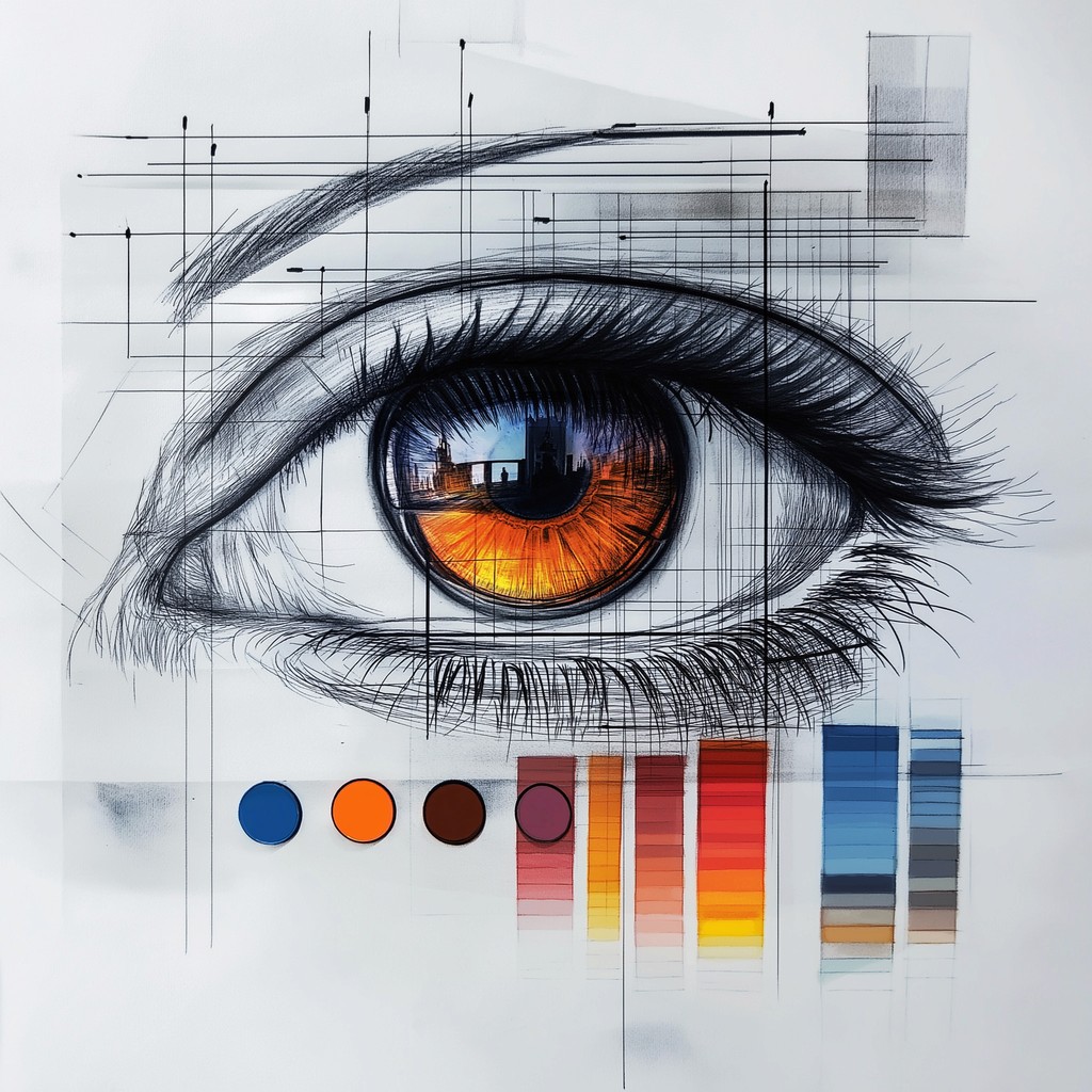
Before I start creating UI elements I need to ensure I set up all the variables and definitions for the design system.
Queen Blue
Marian Blue
Cobalt Blue
Token system
In Figma, tokens are a way to define and manage design tokens such as colors, typography styles, spacing, and more in a centralized way. Here are some advantages of using a token system in Figma for UI design:
Consistency
By using tokens, you can ensure consistency across your designs. When you update a token value, such as a color or a font size, it will automatically update everywhere it's used in your designs. This helps maintain a consistent look and feel throughout your designs.
Efficiency
Tokens help streamline the design process by allowing you to quickly update multiple elements at once. Instead of manually updating each instance of a colour or style, you can make changes to the token and see those changes reflected across your designs instantly.
Scalability
As your design system grows, managing design elements can become more complex. Tokens help you scale your design system by providing a centralized place to manage all your design tokens. This makes it easier to maintain and update your design system as it evolves.
Collaboration
Using tokens in Figma makes it easier to collaborate with team members. Designers can easily reference and use the same design tokens, ensuring everyone is on the same page and working with the most up-to-date styles and values.
Flexibility
Tokens allow you to experiment with different design variations quickly. By changing a token value, you can see how it affects your designs without having to manually update each element. This flexibility can help you iterate on designs more efficiently.
Overall, using a token system in Figma can help you create more consistent, efficient, and scalable designs, while also promoting collaboration and flexibility in your design process.
My token hierarchy and naming convention
Primitives (WHAT)
Primitives is the highest level of my Tokens' hierarchy. This is the "WHAT" of the future design system, and contains properties and values that exist within the entire design.
Primitives include all colours, all spacing variables, all fonts and their parameters, all round corner settings etc.
Colour
Name
Queen Blue
Marian Blue
Alice Blue
Steal Blue
Stone Blue
Cobalt Blue
Little Boy Blue
Value
557392
BDCBD8
EFF8FF
4675A4
8DA2B7
0151A9
609AD3
Name
Red 100
Red 200
Red 300
Red 400
Red 500
Red 600
Red 700
Value
FDC9C9
FDA2A3
FE8787
FD5253
EF2627
CC1919
AA1110
Spacing
Name
3xs
2x
xs
sm
md
lg
xl
2xl
3xl
Value
2
4
8
12
16
24
32
48
64
Radius
Name
None
xs
sm
md
round
Value
0
2
4
8
50%
Border Width
Name
None
sm
md
lg
Value
0
1
2
4
Typography (body)
Name
2xs
xs
sm
md
lg
Name
2xs-link
xs-link
sm-link
md-link
lg-link
Name
2xs-semibold
xs-semibold
sm-semibold
md-semibold
lg-semibold
Typography (Font Family)
Primary
Primary (Roboto)
Secondary
Secondary (Inter)
Caption
Caption (Arial)
Typography (Line Height - Body)
Name
xs
sm
md
lg
Value
16
20
24
28
Typography (Paragraph Spacing)
Name
None
sm
md
lg
Value
0
1
2
4
All new values are added to this level. All tokes in levels below get ultimately fetch their values from 'Primitives'.
Semantic (HOW)
This is "HOW" the tokens should be used.
Semantic names convey meaning, purpose, and how and where the asset should be used.
Colour
Name
Primary
Primary-Dark
Primary-Light
Secondary
Information
Value
Queen Blue
Queen Blue 600
Queen Blue 200
Marian Blue
Cobalt Blue
Name
Success
Warning
Error
Highlight
Value
Green 400
Orange 400
Red 600
Evening Lilac
Mapped (WHERE)
This is "WHERE" the tokens should be used.
Those are the tokens that consumed by the designers
Colour
Name
Surface/Success
Icon/Success
Border/Success
text/Success
Value
Success 100
Success 400
Success 600
Success 400
Spacing
Name
Padding/Success
Size
md
Radius
Name
Radius/Success
Size
md
Typography
Name
Font/Success
Font Family
Primary (Roboto)
Size
sm-semibold
Border Width
Name
Border/Success
Size
md
Success
Component Specific (optional)
Depending on the nature of the project and the team set up I might create another layer that defines tokens to be used for specific components explicitly.
Colour
Name
button-primary-background-default
button-primary-background-hover
button-primary-background-inactive
button-secondary-background-default
button-secondary-background-hover
button-secondary-background-inactive
Value
Primary
Primary-Light
Neutral 30
Secondary
Secondary-Dark
Neutral 30
Now that all properties and variables were defined as tokens it is time to start building UI elements.
My approach of creating UI and more specifically when building a design system is a methodology called "Atomic Design"
Atomic design
Atomic design system is a methodology introduced by Brad Frost that breaks down design elements into smaller, reusable components called atoms, molecules, organisms, templates, and pages. This approach is inspired by chemistry, where atoms combine to form molecules, and molecules combine to form organisms, and so on.
Atoms
Atoms are the basic building blocks of a design system. They represent individual UI elements such as buttons, input fields, icons, colours, and typography styles. These elements cannot be broken down any further without losing their meaning.
Search
About
Services
CLP design system atoms
In addition to the atoms what I've already created as tokens (colours, typography etc) I added the rest of the atoms I knew about at the beginning of the project.
Since the platform will be built on an existing KYC solution from a third-party vendor, some elements are inherited while others do not currently exist. However, all elements must be organized in a scalable structure that can be utilized and managed by members of various cross-functional teams with different levels of access.
Icons
I usually start with some icons that I know will be used in other components such as buttons and selection fields.
In this instance the vendor of the software already had a lot of icons in their base solution so I've added and all of them and created new ones that I knew we will need and were missing.
Buttons
SideNav
SF
Utility
Views
Context Utility
Chevrons
Selection Fields
Associations
Management
Conflict Resolution
Alerts
Notifications
8
Buttons
The next step was to create a button.
I had to analyse all the parameters and properties a button will need to have:
Types
States
Sizes
Variables e.g. icon and text
It also helps knowing some use cases and see if there might be a functional split for different components and even different variants of a component. In this case I knew that default and small button sizes will be used in different parts of the application and will potentially be maintained by different teams with different level of access. Therefore I've decided to split the component in two by their sizes.
Here is a breakdown of my default size button component
Icon
Text
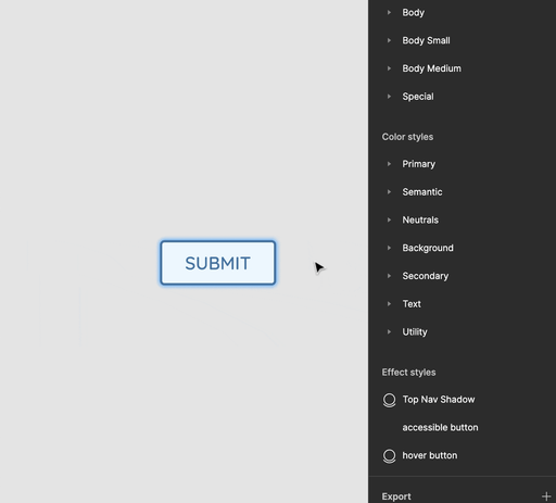
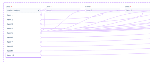
And here is how a button component works once all the parameters are created and variables are linked
In the same manner I have created other components gradually moving from atoms to molecules.
Molecules
Molecules are combinations of atoms that work together as a single functional unit. Examples of molecules include form fields, input groups, buttons with icons, and so on.
As I mentioned before the move from atoms to molecules is seamless. Even a button can be an atom, but almost always a molecule as it usually contains more that one atom in it's component.
Input Fields
Traditionally input fields were very simple and therefore would be an atom, but nowadays input fields are usually complex and have many atoms in them.
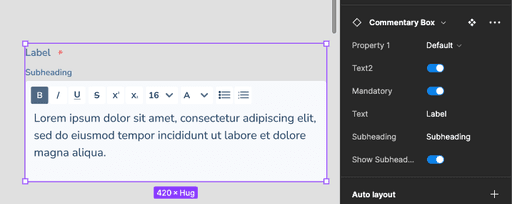
Here is the Commentary field from the CLP design system that I put together.
As you can see it has multiple parameters and different elements (atoms) that make up this commentary field.
Interactive Components
The next stage was to prepare some components for prototypes when interaction is required. These are components that react when user interacts with them e.g. drop down boxes, tip tools, modal pop ups, checkboxes, toggles etc.
Other Molecules
Here are some other dynamic molecules that I've created as part of this task.
Alert Example
List option
Chip 1
Chip 2
Chip 3
Docs
Data
NA
User Assigned
Team name
7/10
Product Name
Account Name:
First and Last name
Account Number:
XXXXXXXX
Balance ($):
1,000,000
Limit/Liability ($):
1,500,000
Label
Tooltip info goes here
Organisms
Organisms are more complex components that are made up of groups of molecules and/or atoms. They represent sections of a UI, such as a header, footer, navigation bar, or card component.
The last stage of Atomic Design I will cover on this page is the creation of Organisms
This is the top navigation of CLP that can change based on the context, but this is 'vanilla' version that contains breadcrumbs, search bar, shortcut to create a new case and link to notification centre with new notifications indicator badge.
SF
And this is the side nav bar.
Updating the UI also becomes extremely simple. For instance, making a change to a single atom will be reflected across all designs that use this atom.
The strength of the atomic design approach lies in the fact that designers using these elements never have to redundantly recreate the same UI elements. This eliminates the risk of inconsistent designs and saves a significant amount of time.