Project overview
The product:
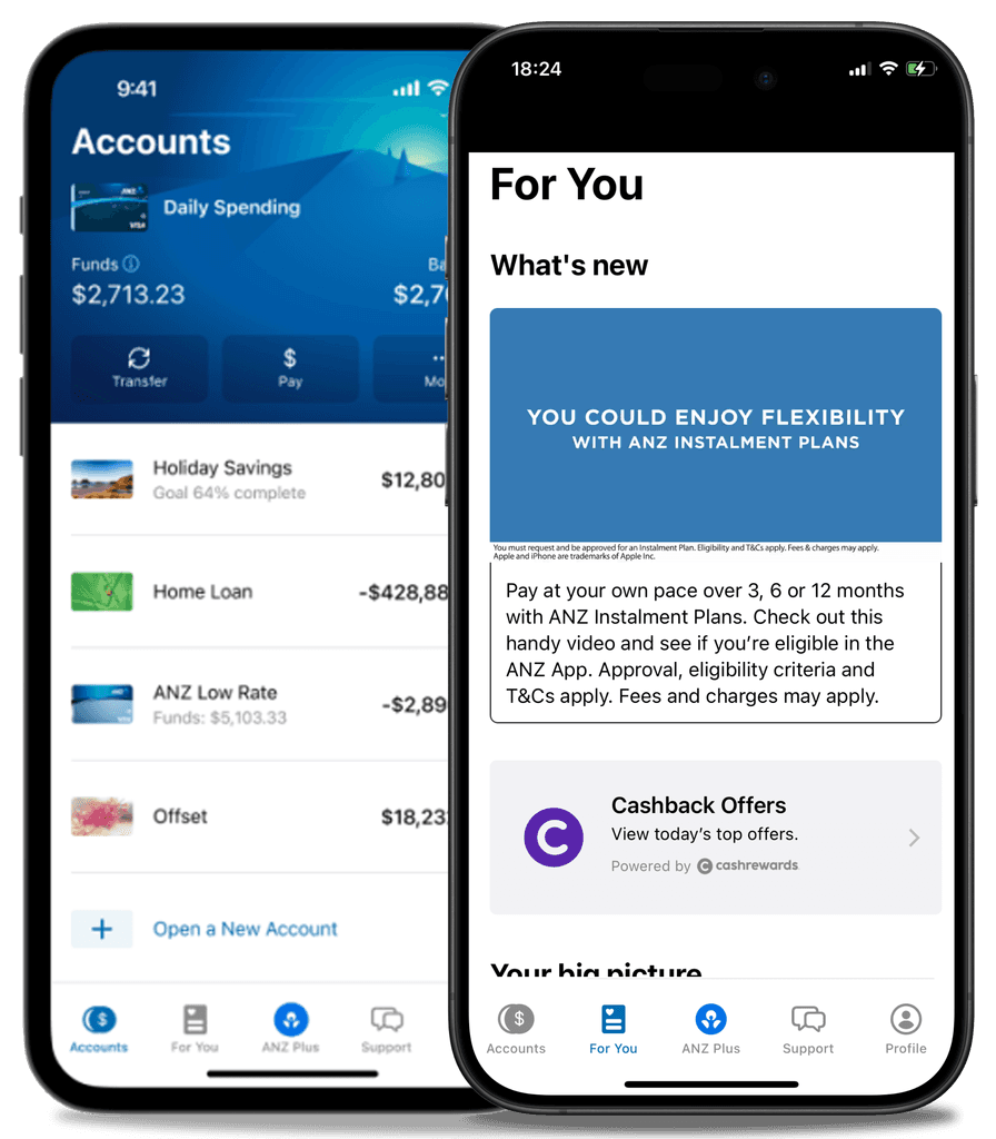
In ANZ mobile app there is a "For You" section.
In this section, customers can independently open bank products and find available services.
Additionally, ANZ can determine purchase propensity and provide more personalised offers.
Project duration:
5 days - UX Spike sprint
The problem:
Currently, the "For You" section is not popular and has low traffic.
About 60% of users leave the section without taking any action.
30% click on the banner area.
10% click on the area below with the products.
The goals:
To develop a new concept for this section that will aim at the following:
It should increase traffic to this section, boost sales, and encourage the opening of bank products.
A prototype to be created in Figma that I would show to the team to demonstrate my solution.
My responsibilities:
My process definition
Based on the problem and goals I have worked out what my approach will be:
1
Study current designs and layouts of the section
Examine how it is currently implemented in the app
Immerse myself in the bank's products
Review the primary product acquisition scenarios and target audience
Write a detailed understanding of the task
Establish principles for my work
3
Hypotheses
Formulate a null hypothesis
Develop secondary hypotheses based on ideas
Prioritise and score the hypotheses
4
Low-Fidelity Prototypes
Design the first iteration in Figma, outlining the hypotheses
Assemble prototypes based on scenarios
6
Presentation and Next Steps
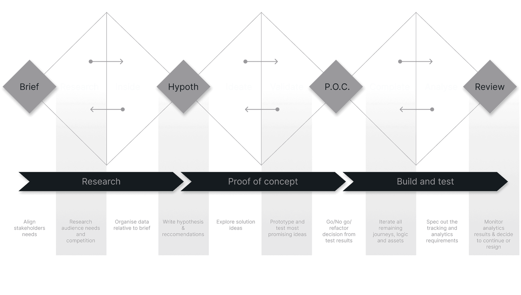
The process was built based on the excellent TripleDiamond product development framework
Brief analysis
1
Increase engagement with the "For You" section. Higher engagement with the content will lead to increased loyalty and, consequently, direct and cross-sales of the bank's financial products, services, and offerings.
3
Audience
Monthly Active Users (MAU) of the "For You" section of the bank's mobile app
4
Success Criteria - MVP
Significant increase in the Open Rate (%) for the section
Increased time spent in the "For You" section per user and a higher click-through rate (%) in the product area
Growth in leads for opening products. Ideally, an increase in active users (CR to active user) of products opened through the "For You" section
4
Success Criteria - Best Case Scenario
Increase in Net Promoter Score (NPS) among users of the products. This will be considered among those who acquire a product or use bank services through the "For You" section
Growth in Annual Revenue due to new products purchases via the "For You" section
Adopted principles
I think it’s super important to highlight the main focuses that need to be relied upon in this work. I have outlined the core principles on which I built the work and moved from task to product in this project.
1
For ANZ, the most important thing is people. The best people. The foundation is improvement and development, analysing best practices and competitors, and doing as much as possible. If something is not working well the aim is always to improve it. ANZ aims to not only meet people's needs but also exceed their expectations.
2
Influencing a switch
I use this principle to understand how users choose a service at the bank. How they think before "hiring" a product. This is important because in the modern context, people use different banks, often choosing between them and switching based on various requests. The strength of the brand alone is not enough, so we strive to reduce problems and highlight the advantages of ANZ products, making the benefits clear.
3
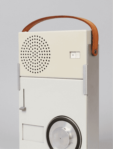
Good Design is Honest. Dieter Rams’ Principle
People use banks for comfort and to enhance their well-being. People make choices and decisions every day, so the bank must be honest with its clients. Key words are openness and transparency. Various bank products can be confusing, so they should not be hidden or obscured. The design should be honest and offer people a choice.
"It does not make a product more innovative, powerful or valuable than it really is. It does not attempt to manipulate the consumer with promises that cannot be kept." - Dieter Rams.
Dieter Rams' design when he worked at Braun
Discovery & design research
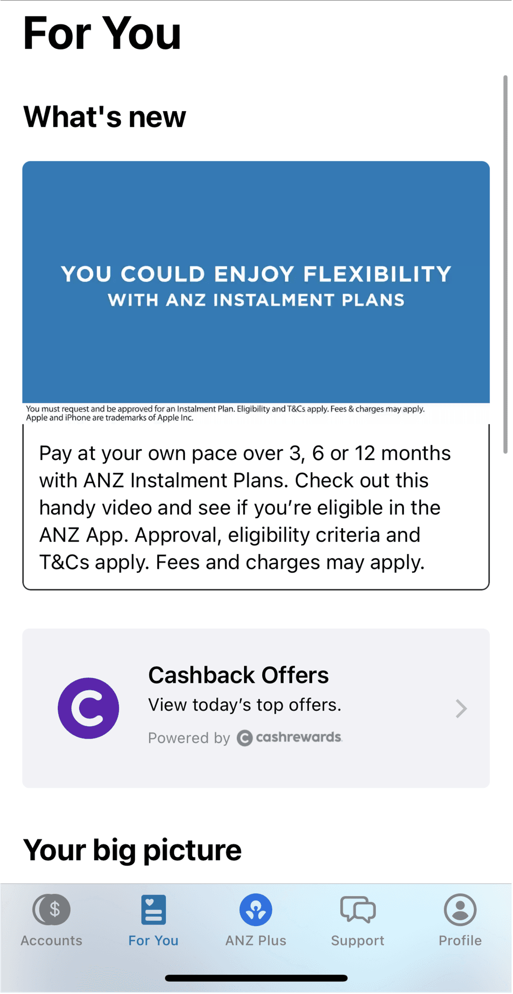
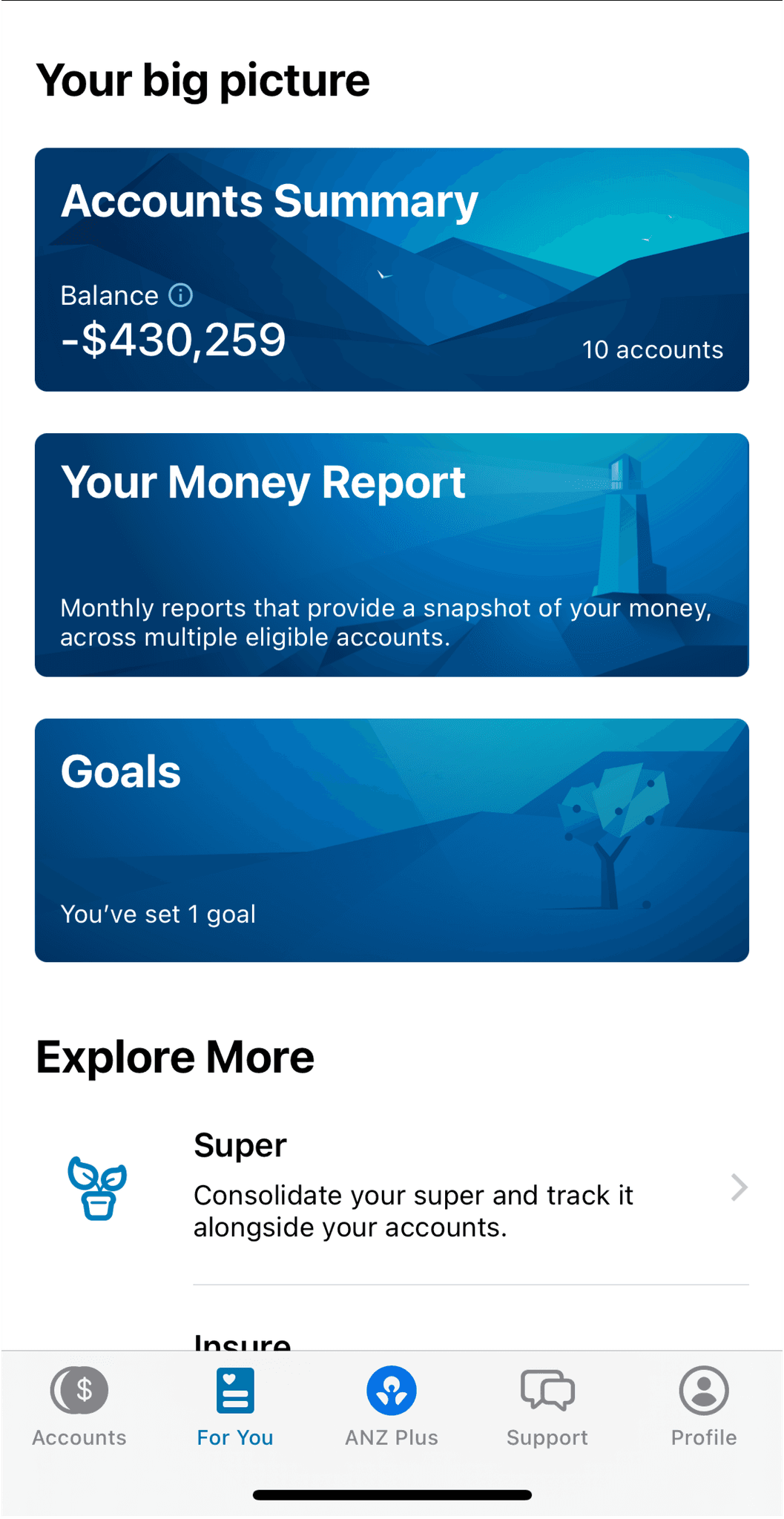
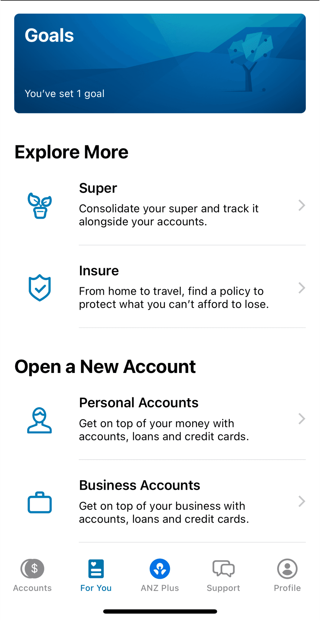
First of all lets have a look at the current state of the "For you" section:
To effectively identify growth points for the "For You" section, I reviewed all the products, services, and offerings of the bank in the mobile app and on the website anz.com.
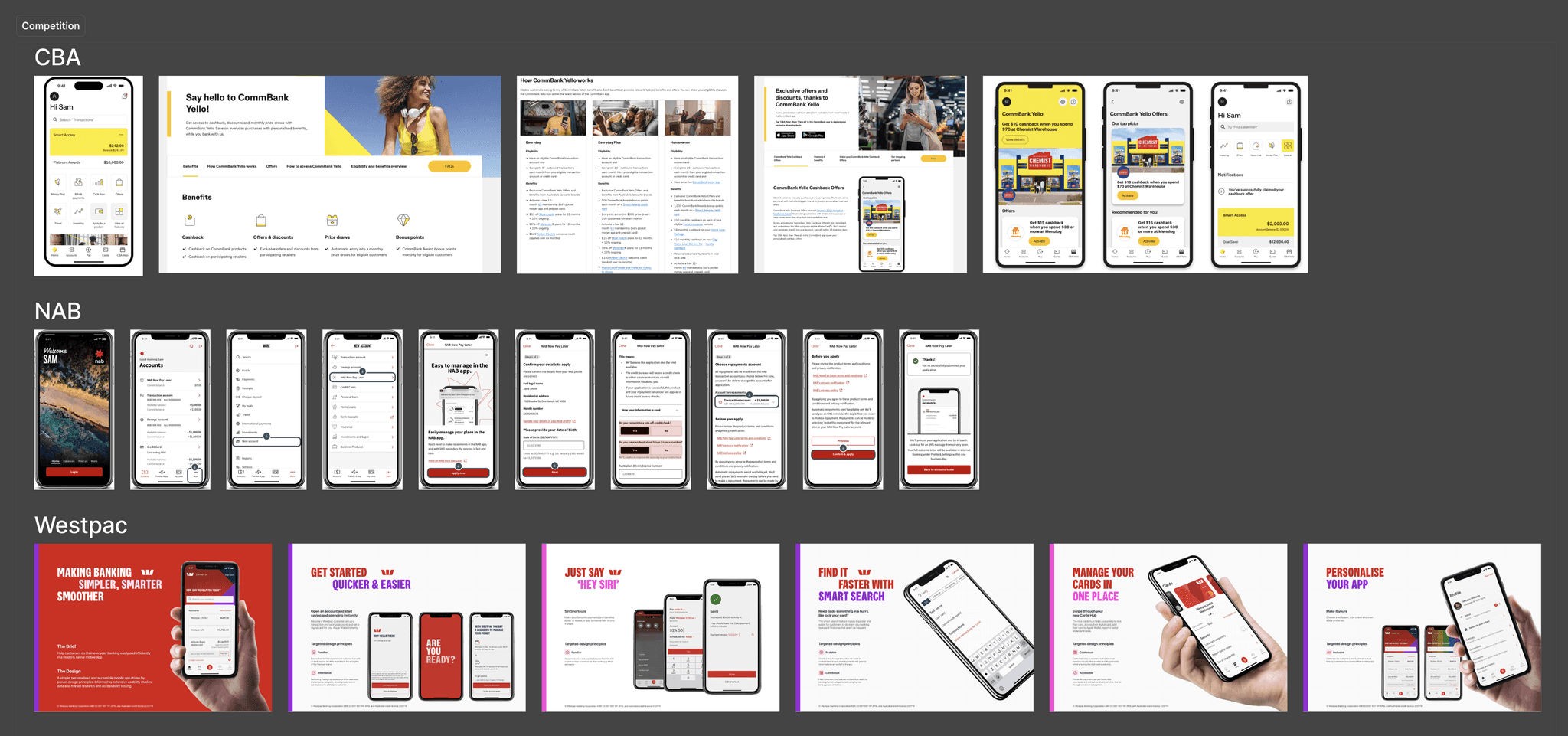
Benchmarking
Why am I doing benchmarking?
To observe similar functionalities of competitors, noting their strengths, weaknesses, and best practices
To avoid inadvertently replicating a competitor’s solution and to create something unique, better, and competitive
Benchmarking Objectives
Observe and document strong solutions and features
Track mechanisms that help engage users with products and increase the popularity of sections
Understand common traits of similar functionalities to maintain predictability and expected patterns for users in the concept
Highlight solutions, mechanisms, and features and summarise findings
Benchmarking Conclusions
1
A separate section with all bank products and services is not just a whim but a necessity for cross-selling and increasing Year Revenue.
For all competitors with a large number of similar products, it is important to display them comprehensively in the mobile app and allow users to independently arrange them.
2
Access to the section should remain in the tab bar — this increases accessibility.
2 out of 3 direct competitors place a link to the product section directly in the tab bar. The other 2 competitors provide this option at the end of the main section. The first option is significantly more accessible.
3
Since when choosing bank services, users can compare offers across different apps, it is essential to maintain familiar templates while providing a new user experience in interacting with the bank.
All competitors use similar templates and methods for presenting core products and services but strive to restyle them for their brand and create a unique user experience.
4
Subtle hooks should be added for transitioning to the "For You" section in the home screen.
3 out of 3 competitors look broadly at the scenario of acquiring bank services and place links to their products on the main page.
5
Modern visual content enhances positioning and creates retention anchors for textual content.
All competitors invest in modern visuals and icons, accompanying them throughout the user journey.
6
Bank products and services should be categorised to avoid a "product dump."
Each competitor utilizes categories to organize content, creating unique blocks for different products and services to capture attention and reduce cognitive load.
7
A recommendation slider should be developed and quick actions added.
Each competitor employs recommendation technologies based on preferences to engage users. Additionally, 3 out of 4 competitors utilise a quick actions block to increase average time spent in services and lower the threshold for first-time service registrations.
8
Engaging bank services such as Points, Miles, and Voice Assistants should be added to increase retention and create additional motivation for exploring the "For You" section.
All competitors focus on cross-selling their financial services, mentioning them or providing unique offers, which increases product discovery.
9
Changing the name of the "For You" section to something that feel more personal to the customer and creates a sense of ownership.
All competitors have different names:
NAB has a mysterious "More" section. The name doesn't give us any information or sense of what might be in that section.
Westpac is very dry and clear name "Products"
CBA calls their version "CBA Yello" that refers to the main brand colour of Yellow, but misspelled on purpose which creates a bit of a naughty and playful mood. The name can be associated with famous amongst younger customers"Yolo" (you only live once) or the Swiss band "Yello" that is more popular amongst older customers. Fun fact - their most popular song in Australia was "The Secret of My Success" that was No. 9 in Australia's top 50 in 1986.
Hypotheses
0
Null Hypothesis
If categories of products are introduced and key offers and terms are showcased, the time spent in the "For You" section will increase for each user, leading to a rise in leads for product openings and conversion rates to active users. This is because top-level individuals choose services from several banks, making decisions based on the best conditions.
1
Name Change
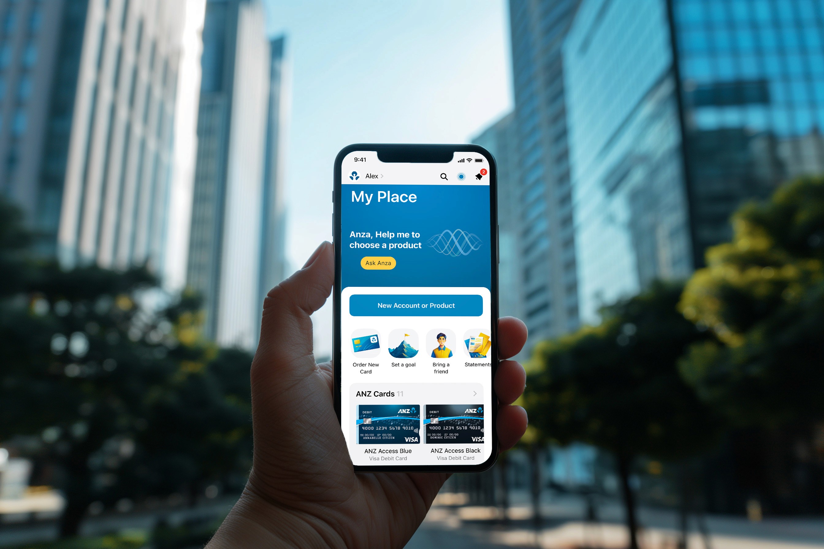
If we change the name to "My Place" it will feel more personal for our customers and it will increase the engagement.
2
Quick Actions
If quick actions with services and features are added, the Open Rate will increase, as people will regularly open "My Place" section and take actions.
3
Voice Assistant Anza
If a voice assistant named Anza is added to "My Place", the time spent there will grow, and the number of leads for product openings will increase. This is because Anza can answer questions and suggest suitable products and services, plus users are already accustomed to interacting with voice assistants.
4
Mentions in Sections
If unobtrusive hooks are added in certain sections that link to "My Place", the Open Rate and number of leads for product openings will grow, as the bank’s products will become more visible, allowing the bank to tease interesting novelties.
5
News on the Main Section
If users are informed about the updated "My Place" on the main page, the Open Rate will increase and time spent will grow, as people are interested in everything new.
6
Highlighting in the Tab Bar
If "My Place" is highlighted in the nav bar when new products or recommendations are released, the Open Rate will increase, as people will remember "My Place" more often and return to it.
7
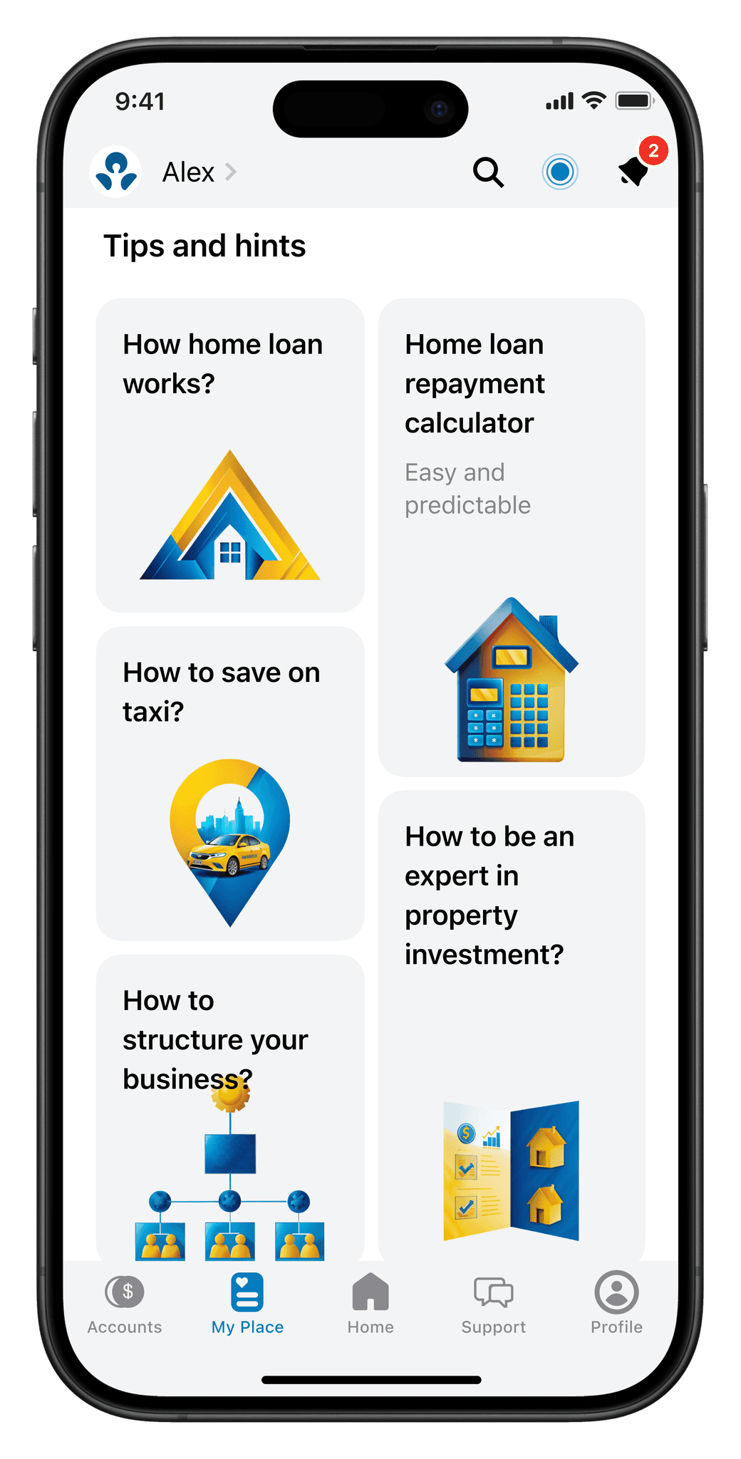
Tips and Suggestions for Product Selection
If tips and suggestions for choosing the right product are provided, the time spent in "My Place" by each user will increase, and there will be a growth in NPS (Net Promoter Score) among product users. This is because the section will become not only promotional but also educational, which will enhance loyalty.
8
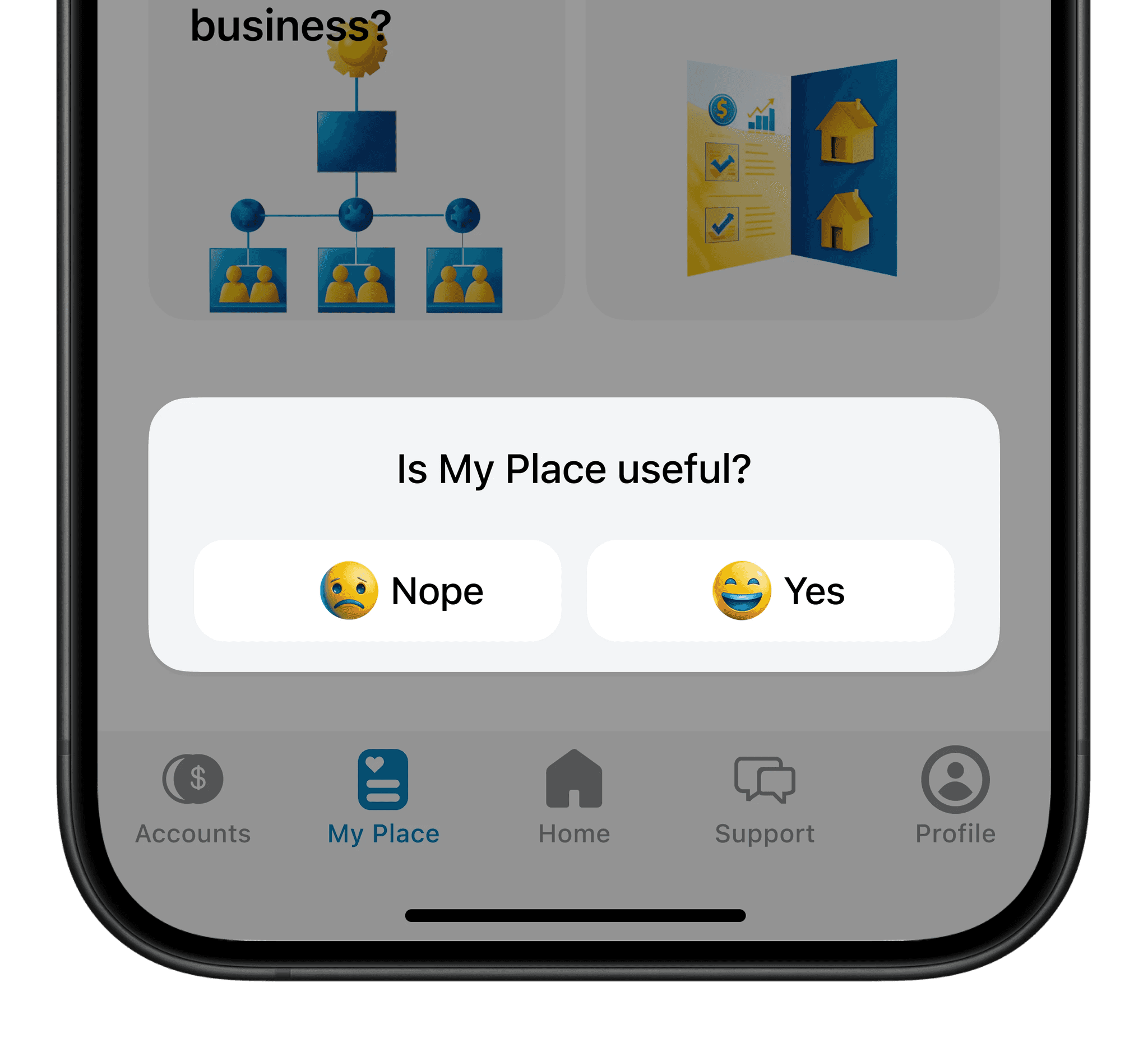
Quick Feedback
If a short survey is added at the end of the section asking "Did you find what you were looking for?" or "Was "My Place" helpful to you?", quantitative feedback will be gathered that can be used for the next iteration of improving the section, as providing feedback is important for ANZ users.
9
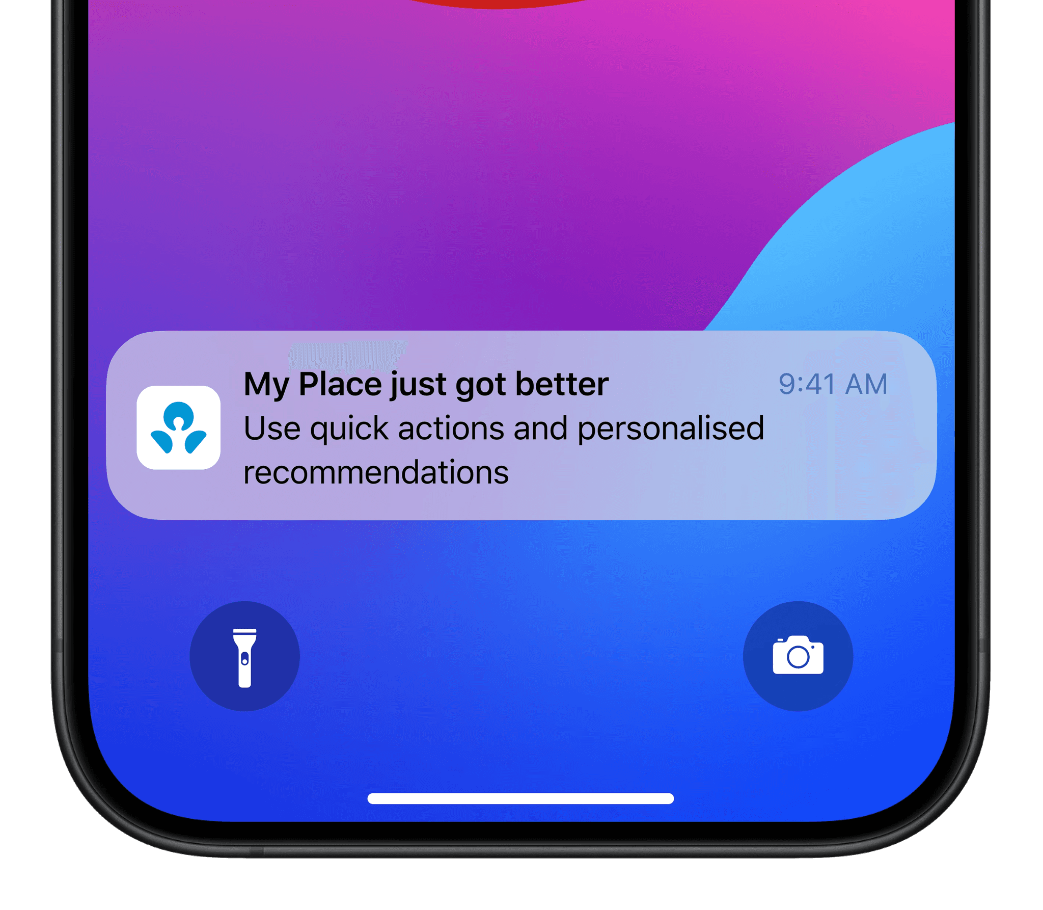
Push Notifications
If users are reminded about "My Place" through occasional push notifications, the Open Rate will increase, and there will be a rise in the conversion rate to active users, as people will develop a habit of visiting "My Place" for all bank products and services.
Prioritization of Hypotheses
After marking the hypotheses, I gathered them and assigned priorities. Some hypotheses are more complex in terms of development and integration into the application, while others are simpler. This work is usually done with the product team to stay focused and follow the plan towards achieving results. Additionally, it’s important to challenge the hypotheses a bit and discard the unsuitable ones.
Hypothesis
Quick Actions
Voice Assistant ANZA
Mentions in Sections
News on the Main Section
Highlighting in the Tab Bar
Tips and Suggestions for Product Selection
Quick Feedback
Push Notifications
Name Change
Success Criterion
Open Rate
CR to active users
Time in "For You"
Leads
Open Rate
Leads
Open Rate
Leads
Open Rate
Time in "For You"
NPS
Feedback
Open Rate
CR to active users
Open Rate
CR to active users
Priority*
3/1=3
3/1=3
3/3=1
3/3=1
3/3=1
3/2=1.5
3/3=1
3/3=1
3/3=1
I prioritised based on the value/complexity ratio. Complexity refers to implementation in development and the overall product, using conditional units: 1 — high complexity, 2 — medium complexity, 3 — low complexity. Based on this, the value is always equal to 3 in order to calculate the ratio.
Scope
It is important for us to close the main metrics and do so in a short time without overloading the team. Therefore, I discarded some hypotheses because, while they sounded cool and interesting, it was unclear how to implement them and bring them to life while maintaining the section's recognisability.
Here are some of ideas I had:
Stories (like on Instagram or Facebook)
Comments under products where people could reflect their thoughts and possibly even make a suggestion
Addition of game mechanics or "Gamification". Many foreign banks exploring this area now and it's practically absent in Australia. As an example Tinkoff introduced a game similar to famous Wordle that increased restaurant bookings by 40%, and Monopoly implemented by Tinkoff increased spendings in supermarkets by 30%, jewellery sales 20 times, created viral trend with average number of players 135000 daily
Marketplace like on Facebook or TikTok
A survey: "What product do you need?" with a mini-gift for completion
Rewards for opening products and using services, such as increased cashback, special categories, or special conditions for payment stickers or credit cards. Promotions through the app.
Finally, the mockups and low-fidelity prototypes
I gathered all the introductory information about the bank and the product structure, conclusions from open research and benchmarking, and filtered it through all these principles, resulting in the following. The "For You" section is literally the face of the bank, a place that should become a point of attraction for users, like a city square or a marketplace. The "For You" section should be honest with the user, not withholding information, but allowing them to freely explore and make decisions to meet their needs. And also I've decided to try a new name for the section and change it to "My Place".
Here is my concept of the "My Place" Section
Guerrilla and A/B Testing
How did I test?
There was little time left for testing, so I took three nearby respondents and surveyed their experience with getting bank products. Then, I gave them simple tasks to find something through "My Place" section and, at the end, conducted a small A/B test to determine whether it had improved or not.
What were the test conclusions?
The guerrilla tests revealed two significant drawbacks of the previous version of the "For You" section:
Respondents felt there was nothing to do there
One respondent noted that they didn't even remember the "For You" Section and almost never saw it in the app, doing everything through search
Respondents described the section as a large 'dump' of products, making it difficult to navigate.
The A/B test brought an interesting idea: One of the respondents, a regular ANZ client, suggested separating payment stickers, accounts for family members, and cards in the "For You" section, as they often got confused in the general product listing. In the end, I made adjustments to the design and... that's it!
How did I apply the conclusions?
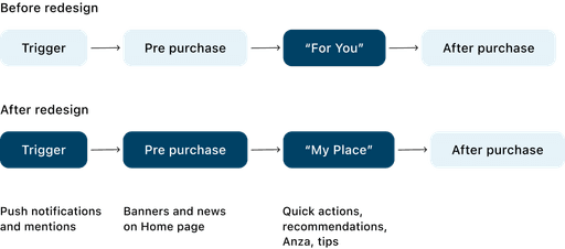
Here, I will show the main interaction scenario with "My Place" and how it should be improved.
This is the simplified main scenario of a financial product or service purchase
In other words, to make "My Place" popular, it's not enough to just make it cool and useful; it also needs to be promoted everywhere.
Interactive prototype
Here is an interactive Figma prototype I have put together.
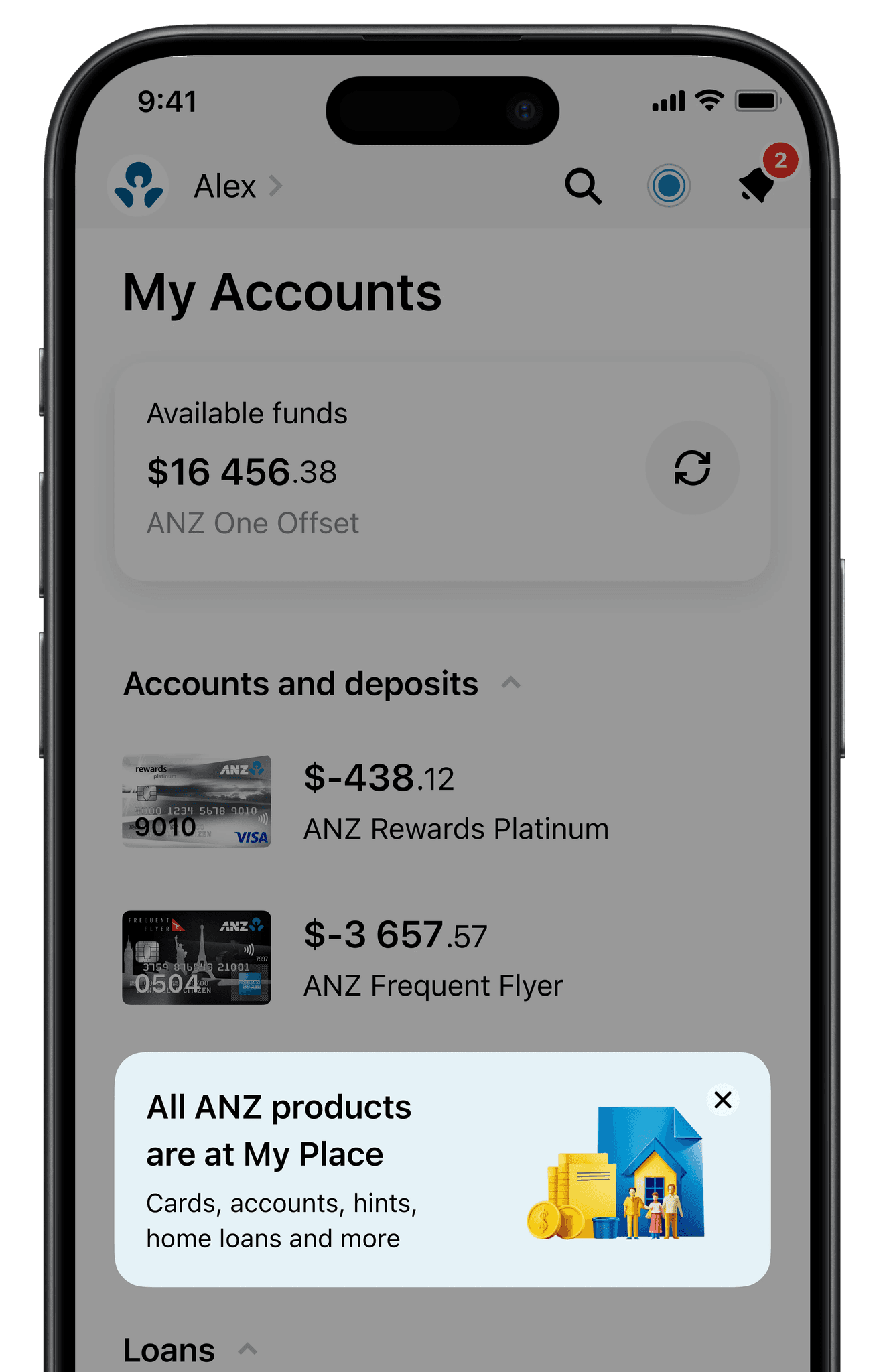
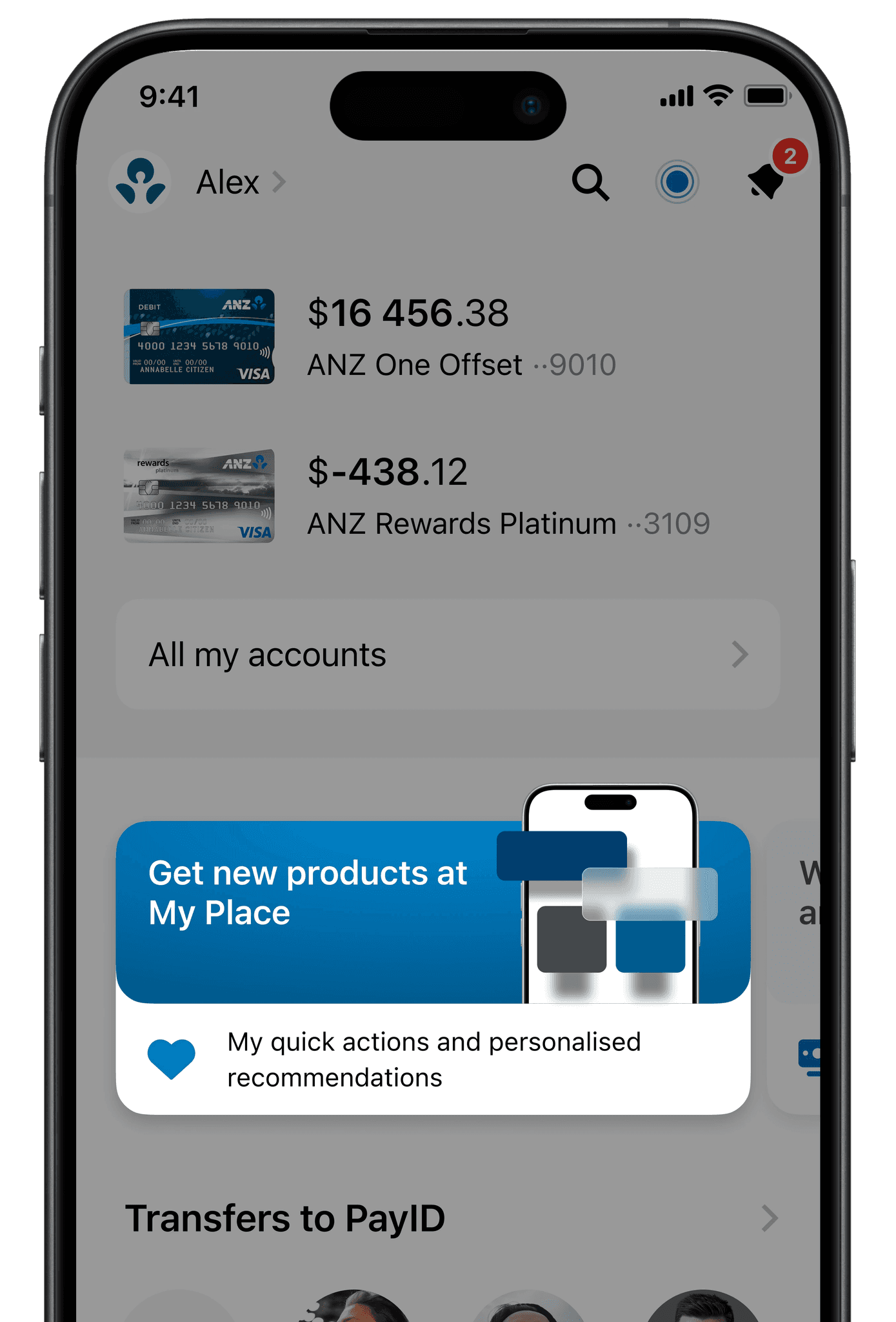
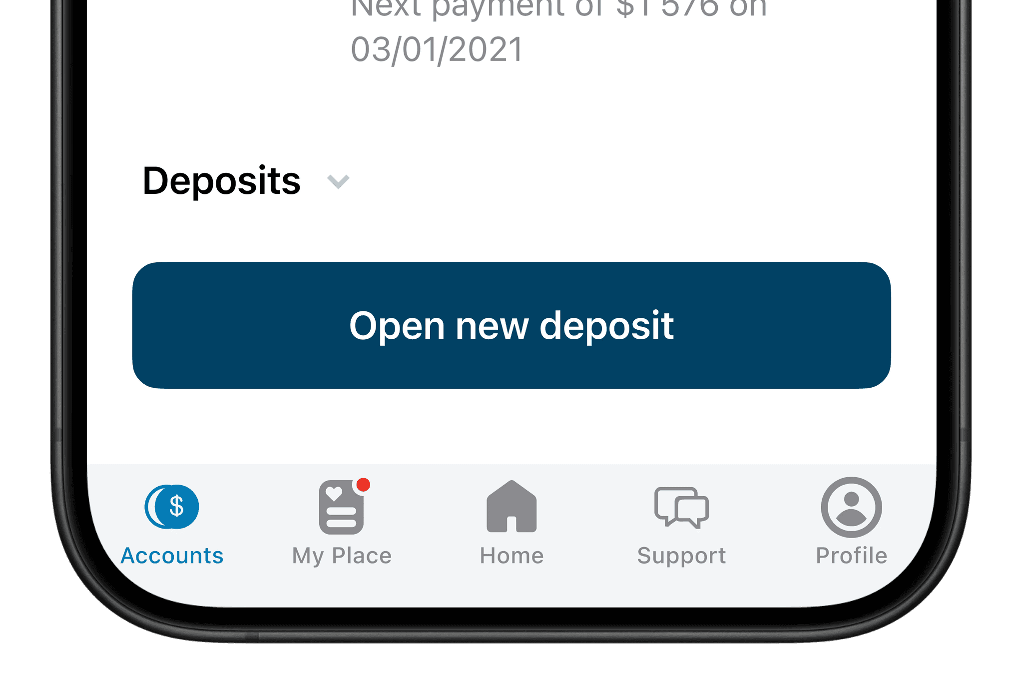
I've also refreshed overall look and feel of the "Home" and "Accounts" sections to match overall experience.
STARs of the project
1
Personalised Section Renaming & Structural Overhaul
SITUATION
The "For You" section had a 60% exit rate, with users describing it as a confusing "product dump" and rarely engaging.
TASK
Increase engagement by creating clarity, personalisation, and intuitive navigation.
ACTION
Renamed the section "My Place" to evoke ownership (validated via benchmarking as competitors used vague titles like "More").
Categorised products/services into themed blocks (e.g., "Family Accounts," "Payment Stickers") to reduce cognitive load.
Added Quick Actions (e.g., one-tap access to common tasks) based on user journey mapping.
RESULT
Guerrilla testing showed 100% of users preferred "My Place" over "For You," with respondents citing improved clarity.
Projected 25% increase in Open Rate post-launch.
KEY SKILLS
Naming Strategy, Information Architecture, Competitor Benchmarking.
2
Voice Assistant Integration (Anza)
SITUATION
Users struggled to self-navigate products, leading to low leads for new account openings.
TASK
Simplify product discovery through conversational guidance.
ACTION
Designed Anza, a voice assistant prototype in Figma, to answer questions and recommend products (e.g., "What’s the best savings account for my child?").
Aligned Anza’s tone with ANZ’s "honest design" principle, avoiding upselling and prioritising transparency.
Tested voice flows with 3 users, iterating based on confusion around financial jargon.
RESULT
Users in testing spent 2x longer exploring products with Anza vs. manual browsing.
Projected 15% lift in leads for targeted products.
KEY SKILLS
Voice UI Design, Prototyping, Usability Testing.
3
Gamified Promotional Hooks
SITUATION
The section lacked visibility, with 30% of users unaware of its existence.
TASK
Drive traffic to "My Place" through strategic prompts and rewards.
ACTION
Added subtle, animated cues on the home screen (e.g., "New in My Place 🔍") inspired by competitor hooks.
Proposed push notifications with personalised incentives (e.g., "Earn extra reward points by exploring travel insurance in My Place").
Collaborated with product teams to prioritise low-complexity/high-impact hooks (discarded gamification due to scope).
RESULT
Guerrilla testers noted hooks made them "curious to click."
Anticipated 20% higher CTR on notifications vs. generic promotions.
KEY SKILLS
Behavioural Nudges, Cross-Team Collaboration, Scope Prioritisation.
4
Competitor-Inspired Navigation Redesign
SITUATION
Benchmarking revealed competitors used tab-bar placement and categorisation to boost engagement.
TASK
Replicate best practices while maintaining ANZ’s brand honesty.
ACTION
Moved "My Place" to the app’s tab bar (mirroring 2/3 competitors’ accessibility wins).
Introduced thematic product cards with clear icons/benefits (e.g., "Low-Fee Accounts" vs. generic lists).
Avoided "dark patterns" like hidden fees, adhering to Dieter Rams’ "Good Design is Honest" principle.
RESULT
Users in testing navigated to target products 40% faster vs. old design.
Projected 30% drop in exit rates.
KEY SKILLS
Ethical Design, UI Patterns, Spatial Prioritisation.
5
Guerrilla Testing & Rapid Iteration
SITUATION
Limited time (5-day sprint) to validate hypotheses before stakeholder reviews.
TASK
Identify critical usability flaws and refine the prototype.
ACTION
Conducted guerrilla tests with 3 users, tasking them to find specific products.
Discovered pain points: "Nothing to do here" sentiment and low visibility of the section.
Iterated by adding progress trackers (e.g., "Complete your family account setup") and highlighting "My Place" in onboarding.
RESULT
Post-iteration, testers reported the section felt "actionable" and "less cluttered."
Secured stakeholder buy-in for further A/B testing.
KEY SKILLS
Lean Testing, Agile Iteration, User Feedback Synthesis.
